How to Design a Company Logo
How we go about creating company logos here at SquareFish, without breaking the bank or losing any hair.
Contents
Chapter 2
Chapter 4
Chapter 1
Before Starting a Logo Design
A logo should communicate a certain message to your target audience. Before you can start the logo design process, you should know:
Who are you talking to?
What are you trying to communicate to them?
Who are you talking to?
Knowing your target market, before designing your logo, is essential.
Your logo needs to speak to them more than anyone.
Example elements of your market to consider;
Age Range
Gender
Location
Income
Values
A great trick here is to create client avatars - caricatures of your ideal customer. You should keep them in mind when making every decision on your logo.
Your logo needs to resonate with your target market. Keep in mind that you might not be within that target market. It’s not about what you think of your logo, it’s about what they think of it.

2. What are you trying to communicate?
Every choice you make during your logo design will affect how your brand is perceived.
Outline your brand’s core values, your product or service benefits and your brand qualities (how your brand should ‘feel’ to the audience).
Think of it as a sliding scale. Which end of the scale do you want to sit at?
Large/Small
New/Established
Friendly/Professional
Fun/Organised
Each chosen colour, font, shape will slide the scale one way or the other.
You don't need to worry about how beautiful your logo is, it just needs to hit the right mark with your audience.
It’s a good idea to have a knowledge of logo elements, and their meanings, while talking to your logo designers.

For further reading on who you're talking to and what your logo says about your company, here are two articles we really liked;
Define your Target Audience on 99designs.com
What your Logo says about your Company on bluleadz.com
Chapter 2
Everything has a baked-in meaning
Colours, fonts, shapes - they all have baked in meanings that you cannot change. Like it or not, orange means cheap (thanks, easyjet).
Your job is to pick the elements that match your brand message.
Elements such as colour, font and shape have pre-conceived meanings baked right in. You cannot change people’s gut reaction to a colour, or anything else for that matter.
For example, at the moment yellow makes people think Covid-19. If your logo is solid yellow, then that’s the first thing that’ll pop into their head.
Fonts, shapes and everything else also have the same pre-conceived notions baked right in, so you have to pick the elements that convey the right message for your brand.
For Example: easyJet

What the logo says: Cheap, playful, doesn’t take itself too seriously.
By using orange, though, they’ve set themselves up to be instantly perceived as cheap, playful and lacking in any sort of gravitas. They’ve got your attention and conveyed that message brilliantly.
The font (big and bubbly) and the shape (rounded edges), also let people know that they’re not expensive and not too serious.
The logo grabs your attention and lets you know what you can expect from the company, even before you’ve read the text.
For Example: Rolls-Royce

What it says: Timeless, sophistication, gravitas
A whole different approach here, but again, the elements have been carefully thought out. Black and white = timeless feel. Strong, traditional serif font = sophistication. All wrapped in an emblem = gravitas times 1000. These elements combined won’t grab your attention, but once it has it, you get the feeling that a huge investment (in a car) will be safe, because the company is serious and trustworthy.
Here’s an in-depth look at how the elements of branding can influence consumers' perceptions.
Chapter 3
The meanings of colours, shapes and fonts.
Every aspect of your logo already has a baked-in meaning that you cannot change. Here, we’ll get right into the detail of what the choices you make will convey to your audience.
Colour
Possibly the most important but, often, the most overlooked element within the design process of a company logo. Let’s look at some phycological meanings behind colour. At least, how different colours are perceived in the Western world.

Red
Red is, possibly, the most universally attention-grabbing colour. It is associated with love, excitement and passion, think Valentine's Day. But, it also signifies danger and aggression, think stops signs and fire engines. Red runs the risk of being misinterpreted, and so, it is usually best used sparingly within a logo, or to have a second colour that will contrast well with it, for example, Coca-Cola's red and white.
Perfect for a company that wants to be seen as;
Exciting
Passionate

Yellow
Yellow is associated with happiness and optimism. It is one of the easiest colours for the human eye to see. You'll notice a lot of bright yellows on companies’ logos that have just one aim; get your attention quickly. IKEA, Ryanair, ALDI and LIDL all use an unnatural yellow tone, usually mixed with a bright blue, to instantly attract your eye. It's not the most subtle approach, but it's certainly effective. So much so, that yellow has become synonymous with cheap, blunt marketing — probably not the best colour to go with if your brand is within a more prestigious industry. The overuse of yellow can also cause fear and anxiety (Yellow is now heavily associated with Covid-19). Best used alongside a strongly contrasting colour, for example; the yellow and red in the McDonald's logo.
Perfect for a company that wants to be seen as;
Cheap
Cheerful

Blue
Blue has connections with being trustworthy, dependable and mentally soothing. Blue is one of the most universally liked colours. While red and yellow can cause a physical reaction, blue affects the mental side of things. It is one of the colours that is noticed last by the human eye and can be perceived as being distant and cold. Blue is a favourite of the tech industry. Companies such as Twitter, Facebook and IBM all lean heavily on blue to evoke a sense of trust, calmness and reliability.
Perfect for a company that wants to be seen as;
Calm
Reliable

Orange
Orange takes the power of red and mixes it with the friendliness of yellow. While not as attention-grabbing as either red or yellow, orange certainly stands out. Used by companies to give off a sense of creativity (Penguin Books) and fun (Nickelodeon T.V.). It can be a riskier option to use as the primary colour, than for example blue, as it is a colour that splits opinion; people tend to love it or hate it.
Perfect for a company that wants to be seen as;
Creative
Fun

Pink
Pink is a softer, less aggressive, version of red. In the Western world, it has associations with femininity, sensitivity and kindness. For these reasons, pink is usually used by brands that are targeting a female audience. An overuse of pink can be perceived as immature and lacking in dominance. The tone of pink can also make a huge difference. Brighter tones can be overly stimulating, while duller tones can be calming and relaxing.
Perfect for a company that wants to be seen as;
Kind
Sensitive

Purple
Purple is often described as being spiritual, mysterious and noble. It has the power of red, while also having the reliability of blue. Purple, as it is rarely seen in nature, has a unique and intriguing quality to it. Often used only as an accent colour in logos, as it can be quite overbearing and distracting when used as the primary colour, especially if used in bright tones.
Perfect for a company that wants to be seen as;
Mysterious
Noble

Brown
Brown is known as a solid, earthly colour. It is also seen as being boring and dull. As it is the colour of soil, wood and other earthly features. Brown has strong phycological connections to safety, comfort and reliability. In recent years, many restaurants, cafés and natural food companies have adopted brown as their go-to marketing colour.
Perfect for a company that wants to be seen as;
Safe
Earthly

Black
Black is perceived as being serious, in control and sophisticated. It also has some very negative connotations with death, darkness and depression. While black is not technically a colour it is the easiest 'colour' to read and offers great contrast alongside most other colours. Black usually works best within a logo if it is balanced out with white, a favourite technique of many fashion labels.
Perfect for a company that wants to be seen as;
Serious
Sophisticated
White
White is known as the colour of cleanliness, simplicity and innocence. In the Western world, white is the colour associated with weddings, angels and new beginnings. But, in many Eastern cultures, it is connected with death, funerals and the afterlife. White, in a logo, is often used to add space between other elements and, again, works best with colours that contrast strongly against it.
Perfect for a company that wants to be seen as;
Innocent
Uncomplicated
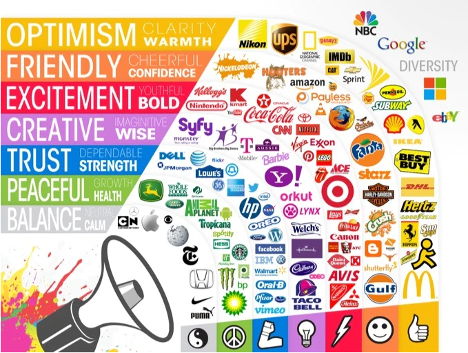
Colour choices of some well-known brands:
For a more in-depth look at colours, and their meanings, take a look at these two great articles;
Color Symbolism and Culture on incredibleart.org
Color Theory for Designers on smashingmagazine.com
Font
The font, or typography, used in your logo plays a crucial part in how your brand is perceived. Not only should the chosen text match up with the colours and imagery of your logo, but it also needs to combine with them in order to convey the values and essence of your brand as a whole.
At a subconscious level, your audience will make assumptions about your company based on your choice of font alone, without even knowing what your company does. At the same time, your choice of font will imply to your audience what type of company you are.
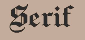
Serif fonts are noticeable for having decorative lines attached to the end of each stroke of their letters (these lines are known as serifs). These serifs allow each letter to take on a distinctive form, making the text easier to read. Commonly used in print media.
Perfect for a company that wants to be seen as;
Timeless
Professional

Sans Serif fonts are essentially Serif font without the decorative lines. These fonts are seen as modern and are commonly used online and in the tech industry - especially within the realm of Social Media.
Perfect for a company that wants to be seen as;
Modern
Tech-savvy

Display fonts are used to create a mood or feeling within a viewer. You can achieve this with other font types, it’s just with Display fonts it can be achieved more effectively. By design, Display fonts ‘stand out’ and work best when they are used appropriately, for example, Display font wouldn’t work well as the standard text on your website but would work well as the main text for your logo. Often, Display fonts are customised to suit, and are unique to, a particular brand, for example, Coca-Cola.
Perfect for a company that wants to be seen as;
Unique
Interesting

Handwritten fonts are used to mimic a person’s cursive style of writing. They are used to offer a more human, personable feel to a piece of text. Today, Handwriting fonts are commonly used by companies, in their marketing, to show luxury, creativity and warmth.
Perfect for a company that wants to be seen as;
Luxurious
Creative


Monospace fonts are distinctive because they allow the same horizontal space for each character of the text. This actually makes Monospace text harder to read, as there is one less way to differentiate between letters. It is a common font of old typewriters and early computer coding, because of their limited graphical capabilities. While Monospace is rarely used in writing today - proportional text has taken its place- it can still be useful for stand-alone words (for example, in logos) or with numbers (having numbers occupy the same width and height makes them easier to read when stacked in rows/columns). It will never be seen as the prettiest font type, but it certainly makes a statement.
Perfect for a company that wants to be seen as;
Traditional
Sturdy
The Psychology Behind Type Choices:

For a more in-depth look at font, and how best to incorporate it in your logo design, take a look at these two great articles;
How to Choose Font for your Logo on logaster.com
Font Psychology in Logo Design on fabrikbrands.com
Shape
The shape of your logo is another vital component to consider.
Let’s take a look at some of the basic shapes, and see how they can affect your audience’s perception of your brand.
Circle

Circular/Oval shapes, thanks to their lack of edges, are perceived as being soft and welcoming.
Having connections with continuity, community, support, femininity, protection, etc. they have traditionally, and continue to be, a popular choice for company logos.
Used in a company logo to show;
Support
Community
Square
Square/rectangular shapes give the human mind a sense of stability and balance.
Where a circle may seem as if it could roll away indefinitely, a square seems as though it will stay in place. This gives the viewer a feeling of reliability and strength. Because the square is more common to the human eye than most other shapes, it can run the risk of being overlooked.
Used in a company logo to show;
Reliability
Strength
Triangle
While the circle signifies community and the square signifies reliability, the triangle is all about fun and standing out from the crowd.
Giving both stability and a sense of motion, the triangle, historically, has been used to portray power, masculinity and creativity. Thanks to its unnatural shape, the triangle has also been tied in with the unknown and the mysterious throughout the ages. This allows the triangle to stand as an easy reference point for a brand that’s looking to stand out or give themselves an ‘edgier’ look.
Used in a company logo to show;
Edginess
Mystery
Lines
Vertical Lines;
Vertical lines are commonly used to portray a sense of power and strength. They can also be used to show stability and reliability. Overuse should be avoided as they can often appear overly aggressive and dominant.
Used in a company logo to show;
Power
Reliability
Horizontal Lines;

While vertical lines give the viewer a sense of power and strength, horizontal lines give off a softer more calming feel. Horizontal lines are seen as more welcoming and tranquil, while also offering the same stability as their vertical counterparts.
They can be a good choice to neutralise imagery that might be otherwise too aggressive or dominant.
Used in a company logo to show;
Calmness
Tranquillity
Organic Shapes
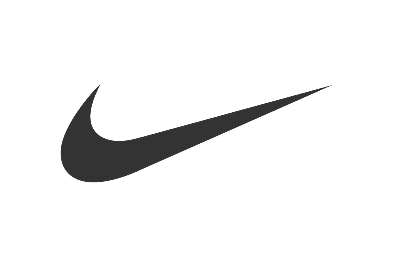
Designed to mirror natural shapes of the ‘real-world’, organic shapes are not as defined as their geometric equivalents. Usually created or incorporated by a brand to express a message that can not be express through traditional means, for example, a circle or a square. Think the Nike Swoosh - a shape that hadn’t existed before, but perfectly reflects the message the company is trying to communicate.
Used in a company logo to show;
Originality
Uniqueness
For a deeper dive into shapes, and how they can affect your audience’s perception of your brand, check out these two great articles;
The Psychology of Logo Shapes from Raffles International College
Why the Shape of a Company’s Logo Matters on fastcompany.com
The 5 Types of Logo
Another aspect of your logo, that will have to be carefully decided on, is the ‘logo type’.
Again, this is not a decision that’s made based on what’s prettiest. It is made based on who you are talking to and what you are trying to say to them.
The decision-making here is, again, largely cut and dry. The implications of each have been set in stone for decades.
1. Wordmark

This is a font-based logo and makes use of just the company's name. Think; Coca-Cola and Google. Their names are catchy enough to stand on their own, once mixed with vibrant colours and eye-catching typography, it makes for strong brand recognition. Depending on your industry, font selection here is of the utmost importance. For example, tech companies tend to go for sleek, stylish fonts, whereas banks would tend to use fonts that are heavier and more solid, to give off a more secure feel.
Best used for companies that are;
Unique
Timeless
2. Lettermark


Also known as a Monogram logo, Lettermark logos consist of just letters — most commonly the brand’s initials. For example, Hewlett-Packard, Independent Television, the New York Yankees and Coco Chanel become much more memorable when they are shortened to HP, ITV, NY and CC, respectively. This is a favoured logo choice of companies that have relatively long names. Initialising the company name, within the logo, allows them to become much more recognisable, and so, much easier to remember.
Best used for companies that are;
Direct
Uncomplicated
3. Brandmark


Also known as a Pictorial mark, the Brandmark logo relies on just an image, symbol or icon to serve as a logo. For example, the Nike swoosh or the Twitter bird. This type of logo forms a more instinctive reaction in the viewer in comparison to written text. It also has the added advantage of being universally recognisable. Usually, a Brandmark is used after a company has become well-known, and the audience knows what the symbol is associated with.
Best used for companies that are;
Established
Well recognised
4. Combination Mark


A combination mark is a mixture of a Wordmark and a Brandmark or, to put it another way, a logo that incorporates both text and imagery in its design. The main advantage here is versatility. Using both text and images gives your brand more of a chance to stick in the minds of your audience. Over time, the symbol you choose will become synonymous with your company. This, in turn, gives you the option to use only imagery (as a Brandmark), should you so desire.
Best used for companies that are;
New
Innovative
5. Emblem
Similar to the Combination Mark, the emblem logo uses both text and imagery together. The emblem logo, ordinarily, looks like an official seal or badge. Think; government agencies or universities. The emblem is a great way to portray your company as being distinguished, serious, stable and trustworthy. This is why they are most commonly used by companies whose customers trust them with large investments (car companies, universities, banks, etc.)
Best used for companies that are;
Reliable
Serious
Here’s some further reading on the main types of company logos;
Types of Logos on 99designs.com
Types of Logos on ebaqdesign.com
Chapter 4
Our Logo Design Process
Here at SquareFish, we tend to use the “Logo Contest” on 99designs.com.
Cost: €269
Timeline (start to finish): 12 days.
Click here for our favourite free logo design options instead.
Designing your own logo sounds like fun. We’ve tried, but found it was a huge waste of time.
Here’s what we learned:
It takes 5 times longer than you'd think
The end result is never as good as you first imagined
Nowadays, to design our company logos, we use 99Designs.
Our favourite feature of theirs is the ‘Logo Contest’. It costs €269 and takes 12 days (from start to finish)
The steps:
Prepare your brief
Designers compete for your work by submitting draft logos
Through a series of rounds, you whittle the designers down, whilst they make adjustments from your feedback.
Choose your winner & they send over all the files
Here’s a more detailed look at each of the 3 stages involved when designing a company logo with 99Designs.
1. Prepare your brief:

During this stage, you’re given different options which help you describe the logo you’re looking for. These include scalable preferences (pictured below), that you can adjust in accordance with your brand. There’s also a section that allows you to write a general brief on what you’re looking for. For example, the brief for a drone inspection company Mech-V, a business we work alongside and for which we recently created the logo, read; “inspections of wind turbines and other renewable technologies...mainly via the use of drones“.
You’ll also be asked to choose, from a selection of different logos, the type you’re looking for or ones that you feel would be the most appropriate for your brand. A tickbox section of the colour/s you’re looking for will also be displayed. All of this information will be relayed to the independent designers that operate within 99Designs.
Top tip
During this section, it’s worth being as broad as possible. Even if you have a particular colour, shape or design in mind, allow some wiggle room, it will ensure more variety during the first round of selection, and you might be surprised by what pops up.
Based on the price plan that you choose, you will be given a deadline for each stage of the process. The price plan we choose here (the Logo Contest) is for a total of 12 days and costs €269.
It’s worth noting; while setting up your contest, you will be asked if you ‘guarantee payment’ at the end of the competition. It is advisable to say that you will, as this will attract the attention of a lot more designers.
Summary;
Write your brief
Select your preferences
Hit “Go”
2. Enter the selection process:
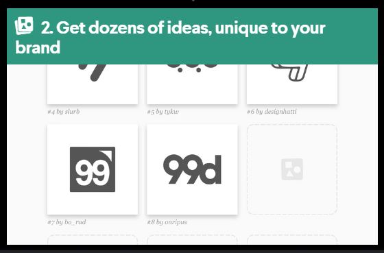
Once you’ve set your preferences, selected your price plan and pressed “Go“, designers will be notified and the ones who feel like they’d be well suited will begin to add their concepts. You’ll be alerted to all new entries via email and they’ll all appear on your 99Designs account page. From here, you can select any that you find appealing, or chat with any designs that you feel might have potential (via the 99Designs messaging service).
For Mech-V, this stage saw a lot of decent entries. But we felt, for some, the colour wasn’t right, for others, the shape was off, the text needed adjustment, it looks good large but gets unreadable or messy when reduced to favicon or thumbnail size.
Top tip
Lots of logos look great on billboards and on the back of hoodies, but when they are shrunk down to fit at the top of your website and/or to be used as an app icon, they can become unsuitable. The vast majority of times your logo is viewed will be at this tiny scale, so it needs to work well when shrunk.
This stage of the process involves a lot of back and forth with your designers. This is a good way to gauge their responsiveness, which will be an important factor as the deadline closes in. You’ll need a designer that can respond to your requests as soon as possible, or else the whole process can become frustrating and a little stressful. This is something to consider when it comes time to decide on your six chosen finalists.
This, qualifying round, stage lasts 4 days. At the end of which, it’s time to select your 6 finalists. (You can select your six favourite designers at any stage during the four days.)
Summary;
Rank your favourites
Discuss ideas with your designers
Select your 6 finalists
3. Choose your winner:
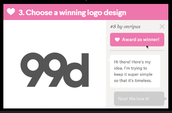
Once you’ve chosen your six finalists, you will move onto the final stage of the contest. Here, if you’re still unsure of the best logo/designer, it’s a good time to bring in other people. Either from your team or someone you feel would have a good eye for such things. Here at SquareFish, we take screen clippings of the entries and then discuss the options with the team members that are involved in the project. This stage is broken down into a 3-day section (choosing your winner from the six finalists) and a 5-day section (working with your winner during the handover process).
Top tip
During the handover process, it is a good idea to ensure that you will receive the correct file types from your designer.Vector files; Can be scaled to any size without losing quality or resolution.
Vector file types include; EPS, PDF and .ai.
Raster files; While being more common, these are pixel-based files, and so will lose quality and resolution as they are enlarged.
Raster file types include; JPG, PNG and GIF.
In short, for every Raster file you receive, you should ensure that there is a Vector file equivalent.
Summary;
Select your winner
Finalise the handover process
99Designs Logo Contest Timeline (After you’ve hit Go!);
Qualifying round (4 days)
Final round, working with your six chosen finalists (3 days)
Choosing a winner and the handover process (5 days)
Other websites that offer similar products include; DesignCrowd, Fiverr, DesignEvo and Wix.
Samples of work throughout the logo design process for Mech-V within 99Designs;
Setting the Brief
(Click to enlarge)
Final Six Designers
(Click to enlarge)
Winning Logo
(Click to enlarge)
Chapter 5
The best free logo design tools
If you’re looking to create a free logo for your company, or if you want to just get a few ideas; the free Logo Maker on Wix.com is a great option.
Cost: Free
Timeline start to finish: 30 minutes
When we want to go play with logo ideas for free, this is where we go. You won’t get the most unique designs, and the ‘fine-tuning’ options are limited, but, as free logo makers go, this is top of the class.
Here’s our 9-step process for designing a free company logo with Wix.
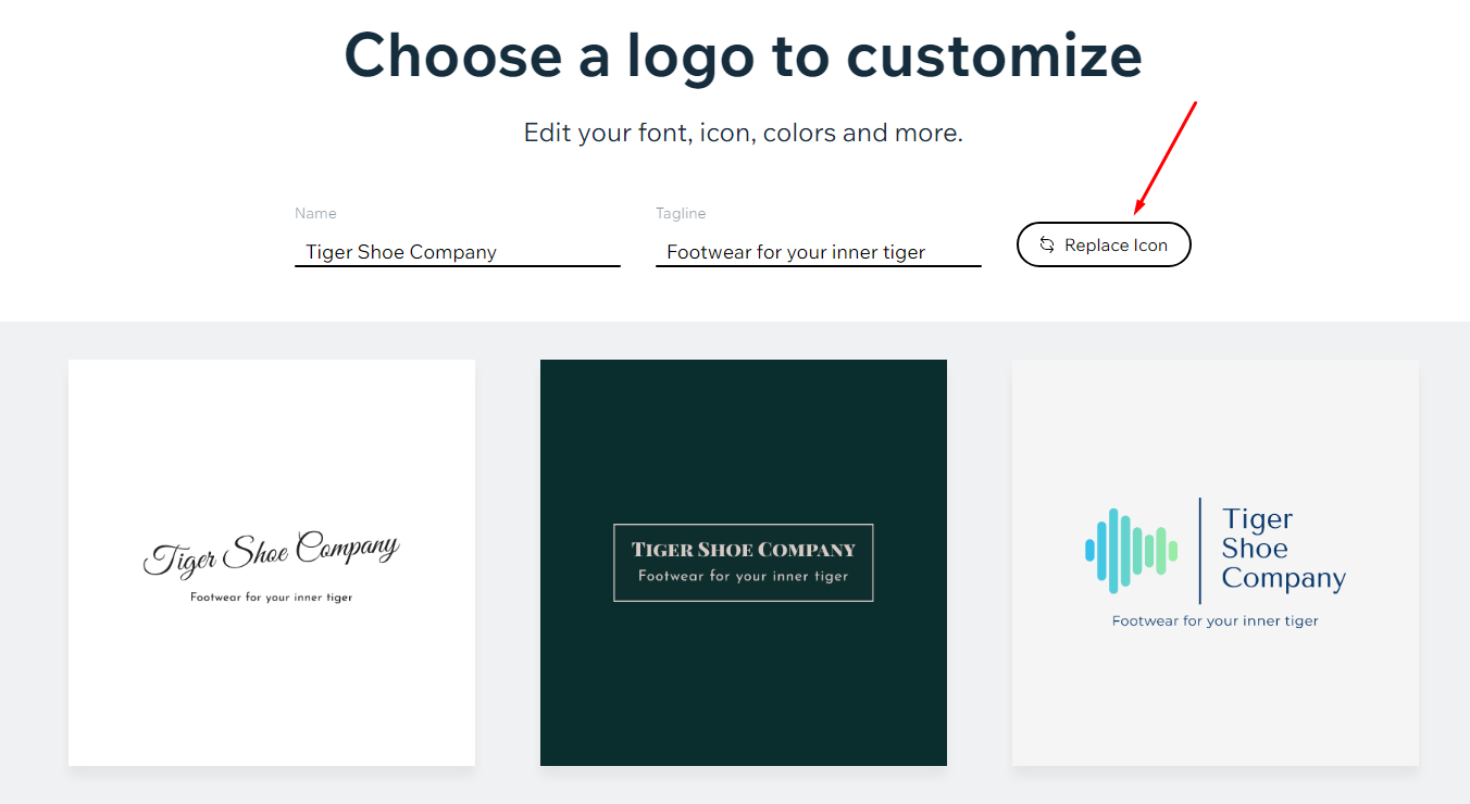
In this example, we’re going to create a logo for a brand we’ve just made up called Tiger Shoe Company.
All you have to do, to follow along, is sign into Wix.
Step 1;
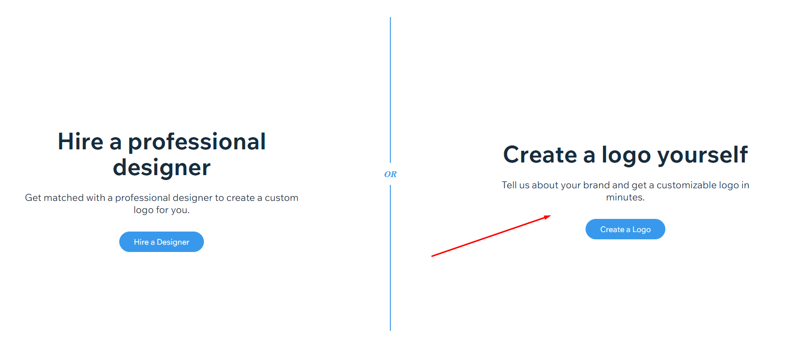
To access Wix’s free logo maker, select; ‘Create a logo yourself’

Step 2;
Add your Company Name (and optional Tagline)
Step 3;
Select your business or industry type
Step 4;
Select the options for your logo’s look and feel
Step 5;
Click whichever logo you prefer (2 logos x 5 rounds)
Step 6;
Select where you want your logo to be displayed
Step 7;
Browse the automated results, click ‘Replace Icon’ if needed
Step 8;
Search for your preferred Icon
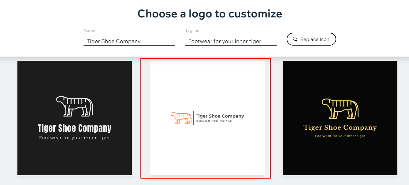
Step 9;
We have a winner!!!
Other websites that offer free company logo makers:
Resources
All the links we’ve mentioned in one handy place
Chapter 1
Before Starting a Logo Design Process
Chapter 3
Elements of a Logo
Resources on Colour
Resources on Font
Resources on Shape
Resources on Logo Types
Chapter 4
Our Logo Design Process
Work alongside Professional Logo Designers
99designs.com (our personal preference)
This article is part of the Entrepreneur’s Resource Hub
The Entrepreneur’s Resource Hub is made up of two sections:
We cover the tangible, actionable side of business in our Simple Guides.
We focus on our more personal business approaches in our Business Mantra Series.